finally finished this one.bit of glare on the lower left. guess I need to reshoot.
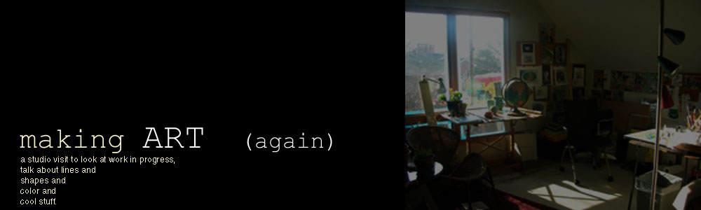
Welcome to my studio, its kind of a mess and a work in progress itself.
Its nice to see visitors from all over the world
who drop in for a look.
Have a look around. MAKE COMMENTS (?) , ideas, critiques or funny jokes.
I'd really like to hear what you think and have a chance to see what you're up to!
Its nice to see visitors from all over the world
who drop in for a look.
Have a look around. MAKE COMMENTS (?) , ideas, critiques or funny jokes.
I'd really like to hear what you think and have a chance to see what you're up to!
title
Pages
2.15.2010
2.12.2010
Happy Valentines Day, Karin!!
My submission to the Thank You Karin Jurick portrait project. I played joke on joke to arrive at this image...much of Karin's fantastic paintings are images of people looking at art in museums, so the museum setting; she owns a framing shop (you can see in the original photo frame samples hanging on the wall) so I framed her (!) and to give some depth and context, I borrowed a thin strip of one of her paintings to create the gallery beyond, This was fun. I'd like to add some deeper value to the green wall, but other work awaits.From Jill Polsby, who organized this great and fun effort:
In December 2009, Karin Jurick through her wonderful website "Different Strokes From Different Folks", mounted a portrait challenge. 180 people from around the world were to submit a head and shoulders photo of themselves to Karin so that some other person of the 180 would paint it. Painters painted each other anonymously and then Karin posted all of the wonderful paintings and drawings on http://differentstrokesfromdifferentfolks.blogspot.com/2009/12/hold-your-horses.html
She also created fantastic YouTube videos of the photo morphing into the painting. Be sure and take a look at these as well. It's a fabulous viewing experience!!
http://www.youtube.com/watch?v=rf5CYNe50os
http://www.youtube.com/watch?v=ig_AbM1rWqg
http://www.youtube.com/watch?v=ILvBE2eVyQ4
http://www.youtube.com/watch?v=B5lEKmlhaM4
Big thanks to Jill for pulling this off. Karin should be getting a bound volume includeing all of these portraits in time for Valentine's Day!! See all of the portraits included here.
2.06.2010
#7 - Values and Temperature
2.03.2010
2.02.2010
2.01.2010
1.27.2010
1.22.2010
#2 of 56 - complimentary
1.21.2010
#1 of 56 - primary colors
The real value of the Studio Class is the opportunity to bring in old or current work so that the Instructor, Louis Copt, can see what you're up to and what you need to work on. His immediate response to my previous work was that I needed to push values...a lot...and to incorporate more color into my intentionally limited palette. I had set the goal to do a painting a day, or nearly every day, so I laid out an academic exercise for the first seven paintings.
This first effort is a return to the very basics. While Louis had suggested using complimentary colors, I started with the primary colors. Choosing red, blue and yellow books as the base, literally and figuratively, created a very defined palette that I tried to maintain. All of the colors come into play in the background as well as the reflected light and shadow on the white vase.
Hanging this up on the wall next to my other work the higher contrast values made all of the other paintings disappear into a fog like the one outside my studio!

This first effort is a return to the very basics. While Louis had suggested using complimentary colors, I started with the primary colors. Choosing red, blue and yellow books as the base, literally and figuratively, created a very defined palette that I tried to maintain. All of the colors come into play in the background as well as the reflected light and shadow on the white vase.
Hanging this up on the wall next to my other work the higher contrast values made all of the other paintings disappear into a fog like the one outside my studio!

Subscribe to:
Posts (Atom)


(still in process)


