Welcome to my studio, its kind of a mess and a work in progress itself.
Its nice to see visitors from all over the world
who drop in for a look.

Have a look around. MAKE COMMENTS (?) , ideas, critiques or funny jokes.

I'd really like to hear what you think and have a chance to see what you're up to!

title

Pages

4.23.2010

And another in progress - revisiting the pottery pitchers

When preparing these uncommon views of my common objects, I take many, sometimes a hundred, photos of them in the strong fleeting morning light.  Of course out of a hundred there may be four or five worth working with.  One which I wrote off because of the lack of strong light kept attracting my eye.  It appears misty and the darkness of the pot interiors kept recalling the black hole idea.  I did this one quickly yesterday, attempting to invert the foreground/background or positive/negative space, disrupting the perception of depth and reducing the importance of the objects .    May continue with it.  May call it done.


I found an interview with Neil Hollingsworth from a few years ago at Art in the Real World that helped to ease my trepidation about my working from photos.  Remnants of my art school education are at odds with the heavy use of photos...wasn't done back then.  I think my art education would have been a very different experience had computers and digital cameras been available.  We drew on clay tablets or polished slate and made our pigments for cave wall paintings from burned bones of mastadons.  Fundamentals, you know?


done!

4.22.2010

Looking at work in progress

 I have been working along while cleaning and rearranging my studio.  The warm weather allowed me to move all of my overwintering plants out of the studio window and out into the garden.  They left a mess behind.  The extra room gives me the space to spread out a bit in anticipation of starting to work on larger canvases.  I have several paintings in mind for a larger format and I've been doing some studies.  Perhaps you saw the intriquing photo Elaine/Earthula posted of a shirt ...no, a chemise, a smock, not just a shirt.  I was quite taken with the colors, the textures, the lighting and the beautiful and inventive design she whipped up and exquisitely finished.  I saw it as a painting...or a series or triptych.   So I have done some studies while waiting for my larger canvases to come.


a developing color study above, and a grisaille (love that word) on the right.
both about 6"x12".  below is the reference photo clipped and cropped and set up for a triptych.

I'm finding that this is a difficult subject.  The values are close together, so the color and fine texture will be the thing.  The painting/drawing of the fabrics require a more calligraphic  hand to express the fluidity.


What do you think?  Interesting?  No?  Maybe? 


4.14.2010

Real Photography

I'm preparing submissions to some juried shows and knew I needed to have much better photos to best present my work.  So I hauled a bunch of my paintings down to Jon Blumb's photography studio.  Jon is a well known local photographer who has an impressive portfolio of beautiful images as well as being the go to guy for local artists needing real photographs of their work.  When I picked up the digital images today, I ran  home and downloaded them.  Shocking.  The colors are exactly right, the nuances of glazes come through beautifully...and the glitches and rough spots are there in all their glory!  This is good.  I can see a lot of things I need to be paying more attention to as I develop both images and craft.

I have updated my other blog page Collecting and Collected with the old (photos I took with available light in my studio with what I now think is a color challenged camera!) and the new photos. 

In this age of digital photography, photoshop, illustrator and all the professional seeming tools we have at our disposal, it is easy to believe we are all photogaphers, digital artists, and graphic designers.  It's important to engage the help of real professionals when we need to present a professional image.  The difference is extraordinary.

Please take a look and let me know what you think.  Here's one example.


my photo


Jon's photo.  It almost looks better than the original painting...and the extraordinary detail brings out the good and bad of my technique!!


See the rest of the new photos at  Collecting and Collected

4.09.2010

playing with watercolor

More TV time sketches. Have a lot to learn about watercolor but I think the medium is a good teacher of many color and light lessons.


From Winslow Homer


From JS Sargent

When errors are made, I use the old 'potted palm' masking technique!

4.06.2010

bad things in the blog world?

I am having no end of computer trouble this week.  I am getting stupid pop ups even thought they are blocked and screened in every posible way.  They lock up my computer.  And many Blogspot pages won't load.  And comments I leave never show up because they go poof when the blogsite author tries to approve them.  I've noticed a big slowdown in visits to my site and I'm wondering if others are having the same problems?

4.05.2010

Quartet of Pitchers on a Green Note.


Unfortunately, the richness of the darks and the glazing is lost a bit in these web images.

This one was an interesting challenge.  I specifically chose a tight color scheme and found the further I went along just how many greens can be in a simple green pitcher!

I actually like the earliest sketch stages almost as well as the finished product.  But there is something about the hard 'objectness' of a piece of pottery that begs to be treated with strong hard edges and details that bring out the character of each pot.

The more I work, the more interested I am in the shadows...there is just so much illumination and color shifting that happens as light invades the dark areas.


I think its probably time to explain why I am so drawn these top view looking down images.  Years ago, a colleague and good friend set a large book right on my work table--on top of what I was working on.  All he said was "I think you need to see this."  It was Andy Goldsworthy's first book, Hand to Eye.  Its hard to describe the immediate and deep impact his work had on my way of seeing.  One particular image is never far from my mind...
 
I still find the black void/hole infinitely fascinating after all those years
that I used it as my desktop wall paper as an
ironic statement as to the black hole-ness of the computer!


4.01.2010

Time well spent

Well.  Its really spring!

Seems like everyone had a week or so of the doldrums.  Funny how that happens whether by moon phase of power of suggestion.

I think a bit of the problem may be information overload.  So I spent a good chunk of last week looking through and sorting and culling the huge number of photos I have accumulated for possible painting references.  It was very informative.

I've been painting consistently nearly every day for 5 months.  Its been an academic process of going through alot of the basic painting concepts and technique.  I've done a lot of thinking as to the why's and what's I'm doing.  Contemplating the varying levels of realism, thinking a lot about the integral relationship between drawing and painting, looking at artists that set the standard for where I want to be withing the next couple of years.

So in looking at all those photographs as a group and as a timeline,  saw the changes in what I'm looking for in an image and a definite trend toward the common object veiwed in an uncommon way.  I don't think I've come close to tapping out the possibilities there.

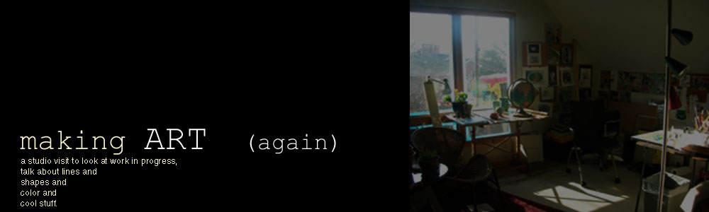
The painting shown here is actually one I started over a month ago.  It started as a quick sketch and I like the way it was going.

But then it became a bit gooey and I was frustrated with the composition.  I set it aside to do the Globes painting and some other work.

 I started another similar painting this week and have gotten into glazing and very specific color studies.  The glazing means I have time while it dries  to work on something else, so I pulled this one out and had a good look at it.  I don't recall what I didn't like about the compsition...it looks ok now!  So I attacked it this afternoon with the benifit of working on a dry surface...Wow, those bright colors actually didn't sink away into the base of oily goo!
 
I spent about an hour on it...I think I was able to keep the fresh brushwork and drawing quality while taking the whole surface 'up a few notches'.


In case any one was wondering...no, I'm not doing black velvet elvis paintings.  I couldn't let the fool's day pass without some silliness!